

Claus O. Wilke is a professor of integrative biology at the University of Texas at Austin. He is the author or coauthor of over 170 scientific publications, and he has authored or contributed to several popular R packages used for data visualization, including cowplot, ggridges, and ggplot2. Claus holds a PhD in theoretical physics from the Ruhr-University Bochum, Germany.
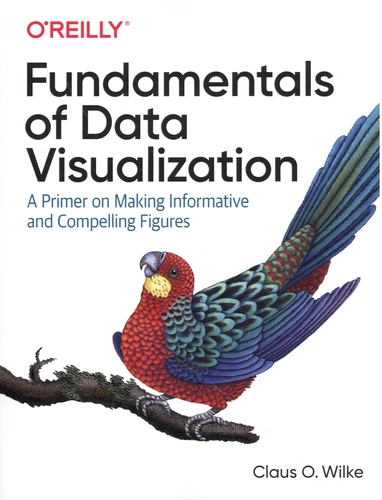
Fundamentals of Data Visualization. A Primer on Making Informative and Compelling Figures
Par :Formats :
- Paiement en ligne :
- Livraison à domicile ou en point Mondial Relay estimée à partir du 28 septembreCet article sera commandé chez un fournisseur et vous sera envoyé 25 jours après la date de votre commande.
- Retrait Click and Collect en magasin gratuit
- Nombre de pages370
- FormatGrand Format
- PrésentationBroché
- Poids0.82 kg
- Dimensions17,5 cm × 23,0 cm × 2,5 cm
- ISBN978-1-4920-3108-6
- EAN9781492031086
- Date de parution01/05/2019
- ÉditeurO'Reilly
Résumé
Effective visualization is the best way to communicate information from the increasingly large and complex datasets in the natural and social sciences. But with the increasing power of visualization software today, scientists, engineers, and business analysts often have to navigate a bewildering array of visualization choices and options. This practical book takes you through many commonly encountered visualization problems, and it provides guidelines on how to turn large datasets into clear and compelling figures.
What visualization type is best for the story you want to tell ? How do you make informative figures that are visually pleasing ? Author Claus O. Wilke teaches you the elements most critical to successful data visualization. Explore the basic concepts of color as a tool to highlight, distinguish, or represent a value ; Understand the importance of redundant coding to ensure you provide key information in multiple ways ; Use the book's visualizations directory, a graphical guide to commonly used types of data visualizations ; Get extensive examples of good and bad figures ; Learn how to use figures in a document or report, including how to employ them effectively to tell a compelling story.
What visualization type is best for the story you want to tell ? How do you make informative figures that are visually pleasing ? Author Claus O. Wilke teaches you the elements most critical to successful data visualization. Explore the basic concepts of color as a tool to highlight, distinguish, or represent a value ; Understand the importance of redundant coding to ensure you provide key information in multiple ways ; Use the book's visualizations directory, a graphical guide to commonly used types of data visualizations ; Get extensive examples of good and bad figures ; Learn how to use figures in a document or report, including how to employ them effectively to tell a compelling story.