

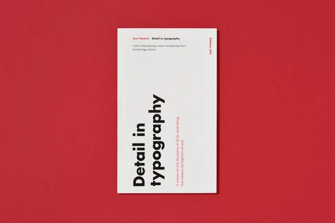
Detail in typographie
Par :Formats :
- Paiement en ligne :
- Livraison à domicile ou en point Mondial Relay estimée à partir du 2 décembreCet article sera commandé chez un fournisseur et vous sera envoyé 127 jours après la date de votre commande.
- Retrait Click and Collect en magasin gratuit
- Livraison à domicile ou en point Mondial Relay estimée à partir du 2 décembre
- Réservation en ligne avec paiement en magasin :
- Indisponible pour réserver et payer en magasin
- Nombre de pages64
- FormatGrand Format
- PrésentationBroché
- Poids0.135 kg
- Dimensions12,7 cm × 21,0 cm × 0,7 cm
- ISBN978-2-917855-66-9
- EAN9782917855669
- Date de parution02/02/2017
- ÉditeurB42
Résumé
An attractive, interesting layout can certainly attract and please the reader ; but when the details are not good, reading requires more effort and any pleasure is short-lived. Detail in typography is a concise and close-up view of the subject - letters, words, the line, and the space around the elements - and it discusses what is essential for the legibility of the text. Yet this is more than a guide to correct typography.
How is it, Hochuli asks, that text can be set perfectly and yet look insufferably dull ? Answers may be found here, not least in the way the book itself has been set and produced. Jost Hochuli is a Swiss typographer, internationally renowned for his book design work. As a teacher, he has had long experience in Zurich and his home town of St. Gallen. As a writer and editor, his books include Book design in Switzerland (1993), Designing books (1996), and Jost Hochuli : Printed matter, mainly books (2002).
He has edited and designed the annually published Typotron series of booklets (1983-1998) and the Editions Ostschweiz (from 2000).