Nouveauté
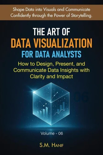
The Art of Data Visualization for Data Analysts: How to Design, Present, and Communicate Data Insights with Clarity and Impact. Data Analytics, #6
Par :Formats :
Disponible dans votre compte client Decitre ou Furet du Nord dès validation de votre commande. Le format ePub est :
- Compatible avec une lecture sur My Vivlio (smartphone, tablette, ordinateur)
- Compatible avec une lecture sur liseuses Vivlio
- Pour les liseuses autres que Vivlio, vous devez utiliser le logiciel Adobe Digital Edition. Non compatible avec la lecture sur les liseuses Kindle, Remarkable et Sony
 , qui est-ce ?
Notre partenaire de plateforme de lecture numérique où vous retrouverez l'ensemble de vos ebooks gratuitement
Pour en savoir plus sur nos ebooks, consultez notre aide en ligne ici
- FormatePub
- ISBN8232828813
- EAN9798232828813
- Date de parution29/11/2025
- Protection num.pas de protection
- Infos supplémentairesepub
- ÉditeurDraft2Digital
Résumé
Unlock the ability to turn raw data into meaningful, visually compelling stories that capture attention and drive smarter decisions. "The Art of Data Visualization for Data Analysts" is your complete guide to mastering the skills today's data-driven world demands-clear communication, powerful storytelling, and visuals that transform complex analysis into actionable insight. Whether you're an aspiring analyst, a professional working with data, or someone who wants to communicate insights more effectively, this book teaches you how to design visuals that are not only accurate-but unforgettable.
Inside, you'll discover how to choose the right chart, use color with purpose, apply design principles, avoid common visualization mistakes, and present insights with confidence. You'll learn the psychology behind how people read charts, why some visuals instantly make sense while others confuse, and how to create audience-centered dashboards that highlight what truly matters. Go beyond the basics and explore practical strategies for communicating insights to stakeholders, supporting decisions with clear narratives, and presenting your findings in ways people will understand, trust, and remember.
With step-by-step guidance, real-world examples, and accessible explanations, this book gives you the confidence to translate analysis into impact-whether you're building dashboards, designing charts, or leading a presentation. You will learn how to:? Shape data into visuals that communicate instantly? Apply proven design principles to create clarity and reduce noise? Craft data stories that influence decisions and inspire action? Design accessible, inclusive visuals for all audiences? Communicate insights with confidence, structure, and purpose? Use Tableau and other tools to bring your visuals to life? Present data clearly-even to non-technical stakeholdersIn a world overflowing with information, the ability to communicate insight is a superpower.
This book gives you the tools to master that power-one chart, one story, and one visual at a time. If you're ready to elevate your analytical work, strengthen your professional credibility, and become a confident data storyteller, this book is your roadmap. Turn your analysis into impact and let your data speak with clarity. Shape data into visuals and communicate confidently through the power of storytelling.

