OFFRE LISEUSES
Une liseuse achetée = une housse offerte* jusqu'au 21 juin
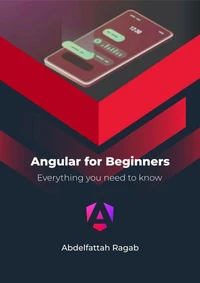
Responsive Layouts. Flex, Grid & Multi-Column
Par :Formats :
Disponible dans votre compte client Decitre ou Furet du Nord dès validation de votre commande. Le format ePub est :
- Compatible avec une lecture sur My Vivlio (smartphone, tablette, ordinateur)
- Compatible avec une lecture sur liseuses Vivlio
- Pour les liseuses autres que Vivlio, vous devez utiliser le logiciel Adobe Digital Edition. Non compatible avec la lecture sur les liseuses Kindle, Remarkable et Sony
 , qui est-ce ?
Notre partenaire de plateforme de lecture numérique où vous retrouverez l'ensemble de vos ebooks gratuitement
Pour en savoir plus sur nos ebooks, consultez notre aide en ligne ici
C'est si simple ! Lisez votre ebook avec l'app Vivlio sur votre tablette, mobile ou ordinateur :

- Nombre de pages41
- FormatePub
- ISBN978-3-384-24344-7
- EAN9783384243447
- Date de parution29/05/2024
- Protection num.Digital Watermarking
- Taille22 Mo
- Infos supplémentairesepub
- ÉditeurTredition
Résumé
In this book, I will explain the three best-known responsive layouts: the flexbox, the grid and the multi-column layout.
Flexbox is a one-dimensional layout that only works in one dimension at a time, either horizontally or vertically.
The grid layout is a two-dimensional layout that distributes the elements horizontally and vertically at the same time.
The multi-column layout is a special layout for magazines and newspapers where the text should flow in columns with spacing, rules and so on.
I'll explain all the properties and their values and how they affect the distribution of elements on the screen.
A propos de Abdelfattah Ragab


CSS Flexbox Layout
E-book
4,99 €
CSS Grid Layout
E-book
4,99 €
CSS Multi-Column Layout
E-book
4,99 €
4,99 €
4,99 €
4,99 €