Nouveauté
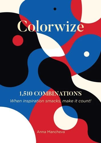
Colorwize
Par :Formats :
Disponible dans votre compte client Decitre ou Furet du Nord dès validation de votre commande. Le format ePub est :
- Compatible avec une lecture sur My Vivlio (smartphone, tablette, ordinateur)
- Compatible avec une lecture sur liseuses Vivlio
- Pour les liseuses autres que Vivlio, vous devez utiliser le logiciel Adobe Digital Edition. Non compatible avec la lecture sur les liseuses Kindle, Remarkable et Sony
 , qui est-ce ?
Notre partenaire de plateforme de lecture numérique où vous retrouverez l'ensemble de vos ebooks gratuitement
Pour en savoir plus sur nos ebooks, consultez notre aide en ligne ici
- FormatePub
- ISBN8231994625
- EAN9798231994625
- Date de parution22/07/2025
- Protection num.pas de protection
- Infos supplémentairesepub
- ÉditeurWalzone Press
Résumé
Colorwize is an 183-page catalog which contains 1, 510 color combinations. The collection features eleven sections: Singles, Red, Blue, Yellow, Purple, Green, Orange, Neutrals, Pastels, Groups, and Interplays. It starts with Singles, where I've selected colors that resonate with me, and are meant to open up your palate for the main course. Please note that, since thereis no standardized code for each individual color, the CMYK values should be considered descriptive rather than precise. Next are the color sections Red, Blue, Yellow, Purple, Green, Orange, Neutrals, Pastels, where you will find combinations built around a central color, with twoto five hues per palette.
These main colors vary in tone. For example, within the Red section, you'll find cherry, burgundy, pink, fuchsia, and more. Some colorsmay appear in multiple sections. For instance, coral can be found under both Red and Orange. Pastels include pale, soft, ashy, candy-like tones. Groups presents more complex combinations - arrangements of 2, 3, and 4 single palettes gathered in an explosion of tints. Interplays is designed for those who are less experienced, offering guided examples to help you navigate this visual feast.
This section provides a space for color experimentation during the creative process. Established palettes are deconstructed and reassembled to test harmony, balance, and spatial behaviour. By varying hue, saturation, and value in controlled ways, these studies explore how colors influence perception and composition. The aim is to expand both the functional and expressive potential of color in design.


